Gallery
ts.plot.set_style("publication") sets the style once; no other rcParams are changed on this page.
import numpy as np
import tausurv as tsfrom tausurv.copulas.clayton import Claytonfrom tausurv.copulas.gumbel import Gumbelfrom tausurv.copulas.frank import Frank
%config InlineBackend.figure_format = 'svg'
ts.plot.set_style("publication")rng = np.random.default_rng(0)
Kaplan-Meier
Section titled “Kaplan-Meier”Marginal or per-group survival from raw . The default treatment includes a pointwise 95% confidence band computed on the logit scale and an at-risk table aligned to the time axis (Pocock, Clayton & Altman, Lancet 2002).
n = 80T_a = rng.exponential(2.0, n)C_a = rng.exponential(4.0, n)Y_a = np.minimum(T_a, C_a)D_a = (T_a <= C_a).astype(int)T_b = rng.exponential(3.5, n)C_b = rng.exponential(4.0, n)Y_b = np.minimum(T_b, C_b)D_b = (T_b <= C_b).astype(int)Y_km = np.concatenate([Y_a, Y_b])D_km = np.concatenate([D_a, D_b])G_km = np.array(["control"] * n + ["treatment"] * n)
ts.plot.km(Y_km, D_km, group=G_km)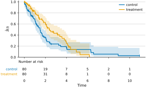
Predicted survival
Section titled “Predicted survival”Generic primitive for . Three modes auto-dispatch:
a 1-D S is a single curve; a 2-D S without group plots every subject as a faded line; with group, aggregates each group as a median curve plus IQR band.
t_grid = np.linspace(0.1, 5.0, 50)S_cohort = np.stack(    [        *[np.exp(-(0.35 + 0.05 * rng.normal()) * t_grid) for _ in range(40)],        *[np.exp(-(0.18 + 0.05 * rng.normal()) * t_grid) for _ in range(40)],    ])G_pred = np.array(["control"] * 40 + ["treatment"] * 40)
ts.plot.predicted_survival(    t_grid,    S_cohort,    group=G_pred,    title="Predicted survival by arm",)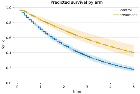
Risk stratification
Section titled “Risk stratification”Auto-quantile-bin subjects by a continuous risk score; KM per stratum with an at-risk table. A model that discriminates gives separated curves, with the highest-risk stratum falling fastest.
n = 400risk = rng.normal(0, 1, n)T = rng.exponential(np.exp(-0.5 * risk), n)C = rng.exponential(4.0, n)Y_rs = np.minimum(T, C)D_rs = (T <= C).astype(int)
ts.plot.risk_strata(Y_rs, D_rs, risk, n_bins=4, title="Risk stratification (quartiles)")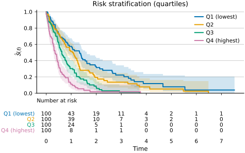
Cumulative incidence (lines)
Section titled “Cumulative incidence (lines)”Aalen-Johansen estimator for competing risks. With causes=[1, 2, 3] you get one curve per cause; with causes=1, group=arm you get a single cause split across subject groups (KM-style).
n = 200T_raw = rng.exponential(2.0, n)C = rng.exponential(5.0, n)Y_cif = np.minimum(T_raw, C)delta_cif = np.where(T_raw <= C, rng.choice([1, 2, 3], size=n, p=[0.45, 0.35, 0.20]), 0)
ts.plot.cif(    Y_cif,    delta_cif,    cause_labels={1: "Relapse", 2: "Death", 3: "Other"},    title="Cumulative incidence by cause",)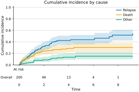
Cumulative incidence (stacked)
Section titled “Cumulative incidence (stacked)”Cohort decomposition over time: stacks each cause’s from zero upward with the residual survival on top, so the total height is 1 at every .
ts.plot.stacked_cif( Y_cif, delta_cif, cause_labels={1: "Relapse", 2: "Death", 3: "Other"}, title="Stacked cumulative incidence",)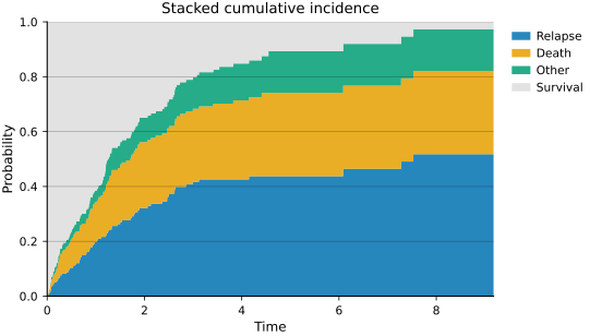
Forest plot
Section titled “Forest plot”Coefficients with confidence intervals. Default x-axis is log-scaled with a vertical reference at — the conventional layout for hazard ratios. Per-row annotations print the estimate and bounds.
names = [    "Age (10y)",    "Sex (M)",    "Treatment",    "Stage III",    "Stage IV",    "Comorbidity",    "Smoker",    "BMI > 30",]hr = np.array([1.25, 0.92, 0.68, 1.85, 2.42, 1.31, 1.55, 1.10])lo = hr * 0.78hi = hr * 1.28
ts.plot.forest(    names,    hr,    ci=(lo, hi),    xlabel="Hazard ratio (95% CI)",    title="Cox proportional hazards",)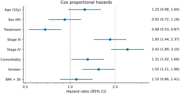
Calibration
Section titled “Calibration”Predicted vs observed probability at a fixed horizon, per quantile bin. The dashed diagonal is perfect calibration. Axes auto-scale to the data range with a small pad and a floor of 0.05, so near-zero CIFs don’t collapse into a corner.
p_axis = np.linspace(0.05, 0.85, 10)models_cal = {    "Cox": {"predicted": p_axis, "observed": p_axis + 0.04 * np.sin(p_axis * 6)},    "DeepHit": {        "predicted": p_axis,        "observed": p_axis - 0.05 + 0.04 * np.cos(p_axis * 6),    },    "RSF": {"predicted": p_axis, "observed": p_axis + 0.02 * np.sin(p_axis * 4)},}
ts.plot.calibration(    models=models_cal,    title="Calibration at t = 2 years",    xlabel="Predicted CIF",    ylabel="Observed CIF",)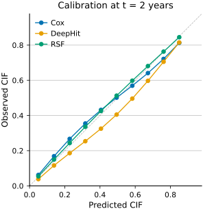
AUC, C, Brier over time
Section titled “AUC, C, Brier over time”Three time-axis evaluation plots share one backbone. Each accepts a single curve, a precomputed models= overlay, or a (n_folds, n_times) matrix as values that renders the fold mean as the line and a SD band.
t_eval = np.linspace(0.5, 5.0, 20)cox_folds = 0.78 + 0.02 * np.sin(t_eval) + 0.03 * rng.normal(size=(5, t_eval.size))dh_folds = 0.82 + 0.01 * np.cos(t_eval) + 0.025 * rng.normal(size=(5, t_eval.size))rsf_folds = 0.76 + 0.015 * np.cos(t_eval) + 0.04 * rng.normal(size=(5, t_eval.size))
ts.plot.auc_over_time(    models={        "Cox": {"times": t_eval, "values": cox_folds},        "DeepHit": {"times": t_eval, "values": dh_folds},        "RSF": {"times": t_eval, "values": rsf_folds},    },    title=r"Time-dependent AUC ($\pm$1 SD across CV folds)",)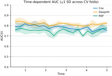
Copula contour
Section titled “Copula contour”Level curves of the joint copula CDF on the unit square. The dashed diagonal is the reference; Kendall’s is annotated in the corner. Side-by-side panels compare families at the same dependence.
import matplotlib.pyplot as plt
cl = Clayton(theta=2.5)gu = Gumbel(theta=2.0)fr = Frank(theta=5.0)
fig, axes = plt.subplots(1, 3, figsize=(9.5, 3.2))for ax, copula, name in zip(axes, [cl, gu, fr], ["Clayton", "Gumbel", "Frank"]):    ts.plot.copula.contour(copula, ax=ax, title=name)fig.tight_layout()fig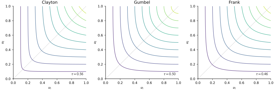
Copula density
Section titled “Copula density”Heatmap of the joint copula density on the unit square. Log-normalised colour scale by default — Archimedean densities concentrate near corners and span several orders of magnitude.
ts.plot.copula.density(cl, title=r"Clayton density ($\theta = 2.5$)")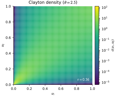
Copula scatter
Section titled “Copula scatter”Marshall-Olkin samples from the copula on the unit square. Useful next to the density plot for verifying the sampler’s geometry matches the analytic density.
ts.plot.copula.scatter(gu, seed=0, title=r"Gumbel sample ($\theta = 2$)")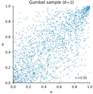
SHAP curves
Section titled “SHAP curves”Per-subject SHAP-over-time. One line per feature, top-K most impactful in the palette foreground, the rest faded gray. Shows when each feature matters and where its sign changes.
n_subjects, n_features, n_times = 200, 6, 30times_shap = np.linspace(0.5, 5.0, n_times)features = ["Age", "Smoker", "Treatment", "Stage", "Biomarker A", "BMI"]

def _feature_curve(slope, peak, sign):    return sign * 0.05 * slope * np.exp(-((times_shap - peak) ** 2) / 4.0)

shap_template = np.stack(    [        _feature_curve(1.2, 1.5, -1.0),  # Age: harmful early        _feature_curve(0.8, 3.0, -1.0),  # Smoker: harmful mid        _feature_curve(1.5, 2.5, 1.0),  # Treatment: protective        _feature_curve(0.6, 4.0, -1.0),  # Stage: harmful late        _feature_curve(0.5, 2.0, 1.0),  # Biomarker A        _feature_curve(0.3, 3.5, 0.5),  # BMI: weak    ])shap_values = shap_template[None] + 0.005 * rng.normal(    size=(n_subjects, n_features, n_times))baseline_S = np.exp(-0.18 * times_shap)
ts.plot.shap.curves(    shap_values,    times_shap,    features,    subject=0,    title="SHAP over time -- patient 0",)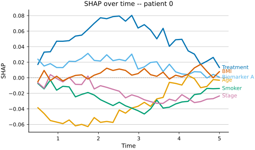
SHAP local decomposition
Section titled “SHAP local decomposition”Per-subject explanation that composes back to the prediction. Top panel: predicted overlaid on a baseline curve. Bottom panel: stacked feature contributions in a diverging palette — blue tones above zero push survival up, red tones below zero push it down.
ts.plot.shap.local_decomposition( shap_values, baseline_S, times_shap, features, subject=0, title="Patient 0: why this survival curve?",)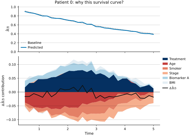
SHAP feature-time heatmap
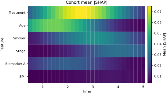
Section titled “SHAP feature-time heatmap”Cohort view: features (rows) by times (cols), colour = aggregate SHAP across subjects. With aggregate="abs_mean" the magnitudes show importance; with aggregate="signed_mean" the diverging map shows direction.
ts.plot.shap.feature_time_heatmap( shap_values, times_shap, features, aggregate="abs_mean", title="Cohort mean |SHAP|",)